Range Filter
Dashboard Designer empowers users to create detailed, customized reports, generating dynamic visualizations that offer a deep and adaptable view of their data. A key feature is the creation of range filters, which allow users to select a specific range of numeric or date values within a dataset. This facilitates the analysis of specific segments of information, enabling the identification of trends, patterns, and outliers more accurately.
How to Create a Range Filter:
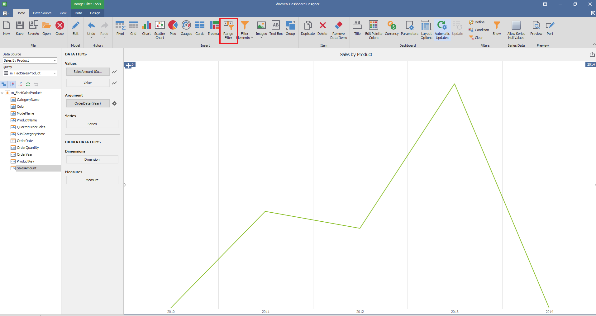
To implement a range filter in Dashboard Designer, start by opening the Dashboard Designer and selecting the report where you want to add the filter. Then, click on the specific 'Range Filter' icon. Drag and drop the numeric or date columns you want to filter from the main view to the designated 'Columns' section within 'Data Elements'. This will allow you to define the range of values that will be displayed in the filter, giving users the ability to refine the visualization results based on their specific needs.

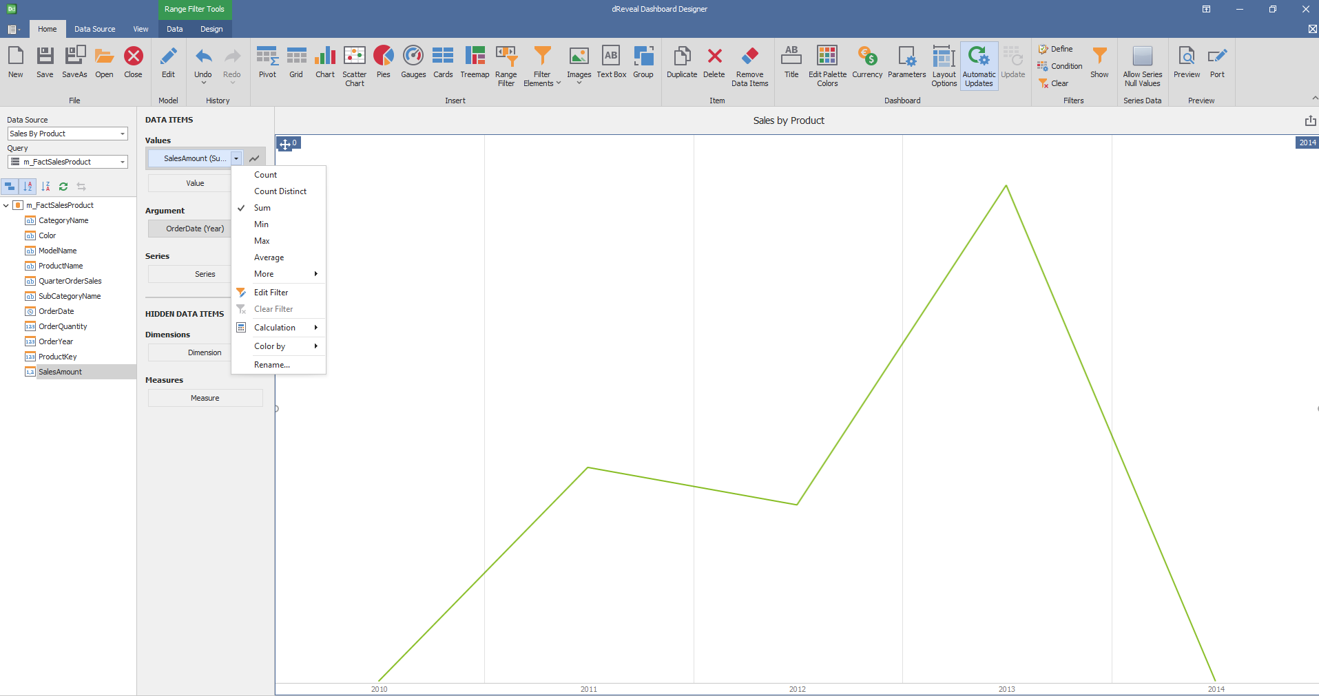
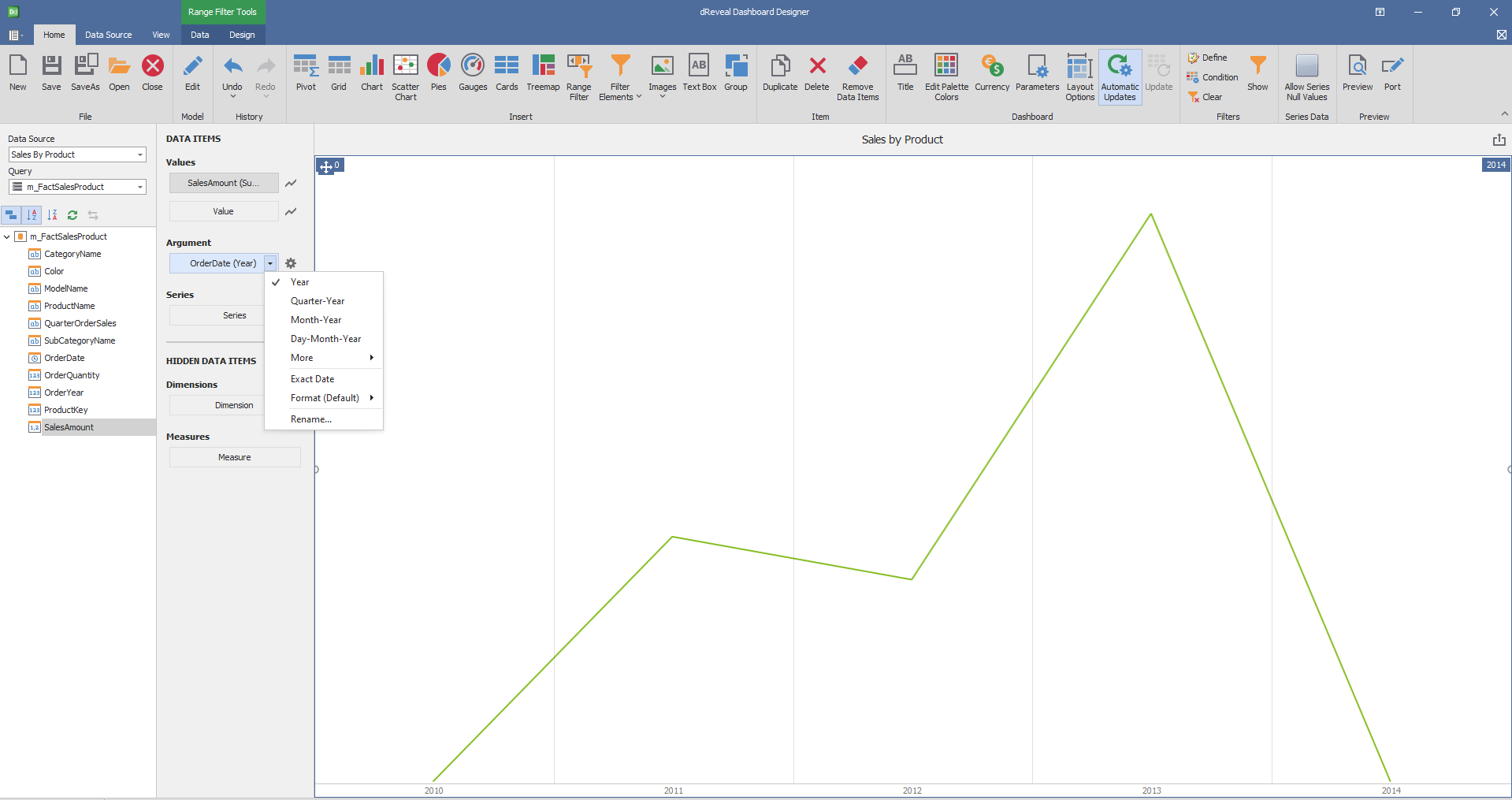
Dashboard Designer also provides various options to customize the 'Range Filter' based on the data type displayed in each column. Below is a general overview of the different options you can apply to your Range Filter Chart.
Column of type String

Column of type Date:

Design
Dashboard Designer also provides various options to customize the 'Ranger Filter' based on the data type displayed in each column. Below is a general overview of the different options you can apply to your Graph.
Series Type
| Options | Description |
|---|---|
| Point Line | The number of columns and rows is defined automatically. |
| Area | Arrange the elements in the specified number of columns. |
| Bar | Arrange the elements in the specified number of rows. |

Interactivity
| Options | Description |
|---|---|
| Edit Periods | Edit date-time periods used to select a predefined range using the range filter. |

Coloring
| Options | Description |
|---|---|
| Show Gauge Captions | Specify wich values should be displayed within data labels |

